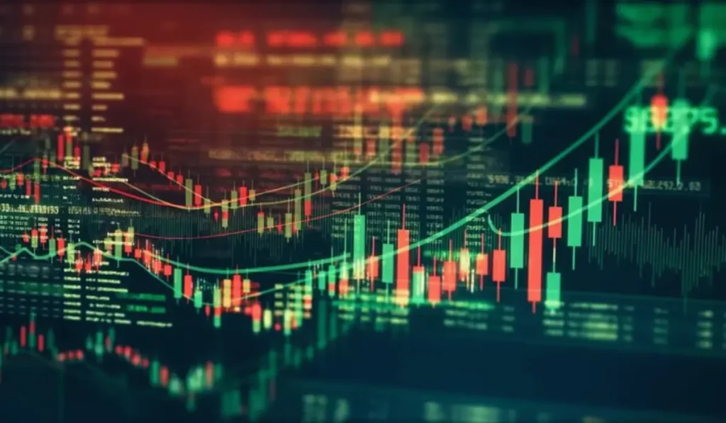
In trading and investing, one of the most popular tools used is candlestick charts. Understanding candlesticks will help you easily read market trends and make wide decisions while investing in crypto, stocks, commodities, or forex. Keep reading to know more about candlestick charts, their history, bullish and bearish candlesticks, the difference between candlestick and line charts, limitations, and much more.
What are Candlestick Charts?
Candlestick charts are financial charts that display price fluctuations over a specific period. Each candlestick reveals 4 pieces of crucial data.
- Highest price
- Lowest price
- Opening price
- Closing price
These charts are quite popular among traders and investors because they clearly show market sentiment and price direction. As they offer more detailed information about market activity, users opt for them instead of simple line charts.
History of Candlestick Charts
The history of candlestick charts is quite interesting. They originated in Japan in the 18th century. It was created by Japanese rice trader Munehisa Homma to evaluate rice prices and market psychology. Currently, these charts are widely used by traders around the world for technical analysis.
A Detailed Understanding of Candlestick Chart
It is important to know the parts of a candlestick chart to understand it clearly. It has two main parts.
- The Body- It shows the difference between the opening and closing prices.
- A green or white body implies that the price closed higher than it opened (bullish)
- A red or black body implies that the price closed lower than it opened (bearish)
- Wick or Shadow- This is the thin line above and below the body.
- Upper wick shows the highest price
- Lower wick shows the lowest price
Long wicks suggest strong buying or selling pressure.
How Candlestick Charts Work?
The working principle followed by candlestick charts is quite simple. Each candlestick shows a specific time period, such as:
- 1 minute
- 5 minutes
- 1 hour
- 1 day
- 1 week
In simple terms, on a daily chart, one candlestick represents the price movement for a single trading day. Traders can easily spot trends and market reversals by examining multiple candlesticks together.
Bullish vs Bearish Candlesticks
For reading candlestick charts, understanding market sentiment is important.
Bullish Candlestick
This happens when investors push prices higher by buying more stocks. The candlestick appears green and indicates upward momentum.
Bearish Candlestick
This occurs when sellers dominate the market. The candlestick shows red and indicates downward momentum.
These signals help users gain clarity about buying and selling opportunities.
Common Candlestick Patterns
This refers to patterns formed by one or more candlesticks. They help identify future price movements. The following are the most important candlestick patterns that novice traders should know:
1. Doji
This forms when opening and closing prices are almost the same. It indicates market indecision where buyers and sellers are evenly matched. Doji suggests a potential trend reversal.
2. Hammer
This pattern consists of a small body, a long lower wick, and little or no upper wick. Hammer usually appears after a downtrend and signals the possibility of a bullish reversal.
3. Shooting Star
It is the opposite of a hammer. This pattern consists of a small body, a long upper wick, and little or no lower wick. A shooting star appears after an uptrend and signals a bearish reversal.
4. Bullish Engulfing Pattern
This pattern comes up when a large bullish candlestick completely covers the previous bearish candlestick. It indicates a strong buying pressure and the possibility of an upward trend reversal.
5. Bearish Engulfing Pattern
This pattern occurs when a large bearish candlestick covers the previous bullish candlestick. It suggests a strong selling pressure and the possibility of a downward trend reversal.
Candlestick Charts vs Line Charts
Most novice traders wonder why users choose candlesticks over line charts. Here is a comparison of both that will give you clarity.
| Feature | Candlestick Charts | Line Charts |
| Reveals Opening Price | Yes | No |
| Reveals Closing Price | Yes | No |
| Reveals Highs and Lows | Yes | No |
| Better for Technical Analysis | Yes | Limited |
| Simple to Identify Patterns | Yes | No |
As you can see, candlestick charts offer more data, making them best for active investors.
Tips for Beginners Using Candlestick Charts
- Study basic patterns first
- Use multiple time frames
- Combine with other indicators
- Practice using demo or trial accounts
- Avoid emotional trading
Limitations of Candlestick Charts
Though candlestick charts are very helpful, they have certain limitations.
- Patterns can provide wrong signals
- Markets can be unpredictable
- Patterns function better with confirmation indicators
- Novice traders may misinterpret signals
Experienced investors use candlestick charts as part of a broader investment strategy.
Final Thoughts
Candlestick charts are one of the best tools to understand financial markets. They help traders and investors identify possible trend reversals, trends, and price action. For newbies, starting with basic candlestick patterns, like Doji, Hammer, and Engulfing, is wise. Whether you trade stocks, crypto, forex, or commodities, candlesticks will help you make informed decisions and clearly understand market behaviour.